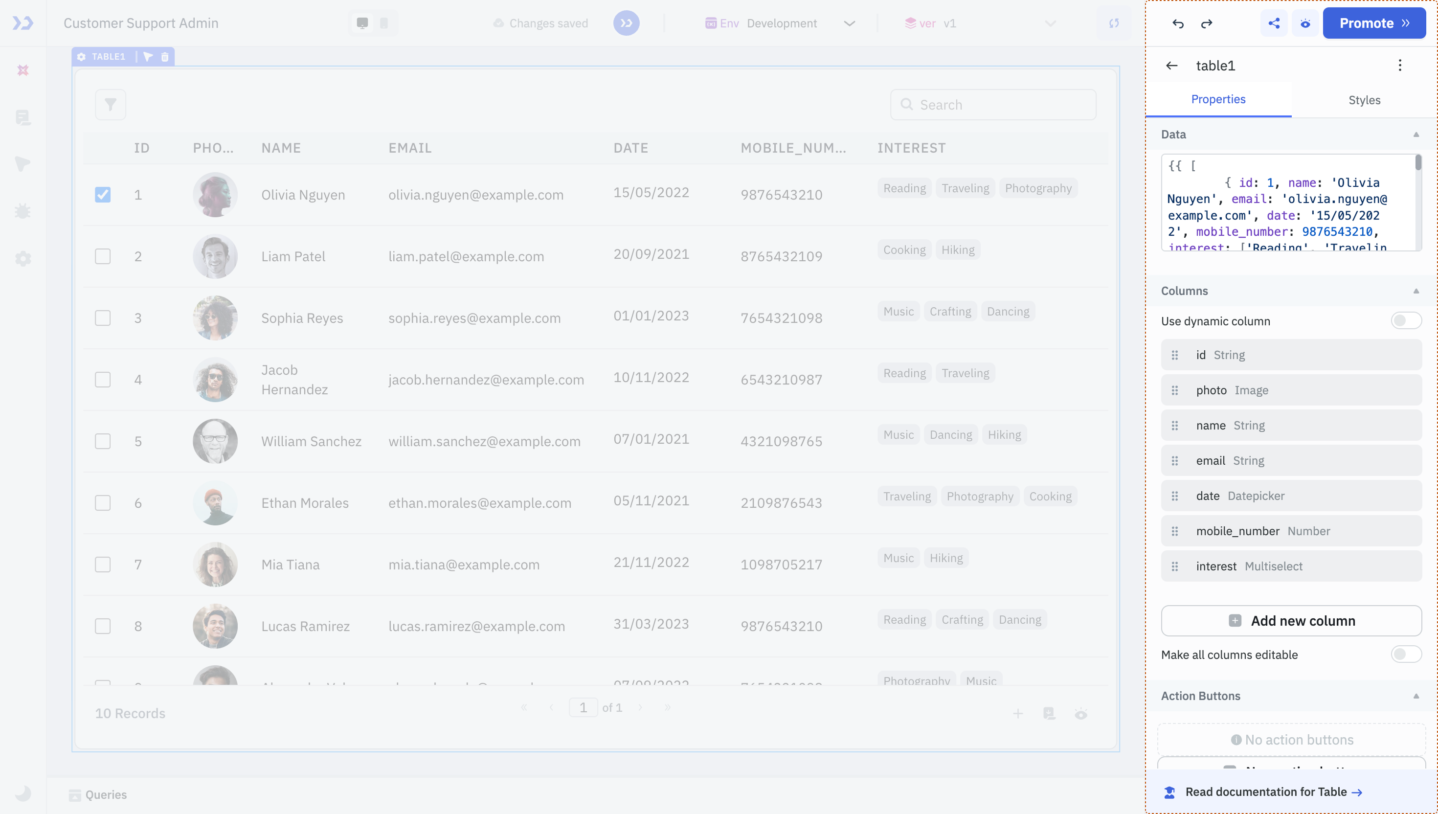
Component Properties
Component properties define the appearance, behavior, and interactivity of UI components in ToolJet. It also allows you to configure component-level permissions, enabling only selected users or user groups to interact with the component.
Each component includes a unique set of properties based on its functionality. Here’s an overview of common types of configurable properties:
- Labels and Data Fields: For input components, you can configure the label, add placeholders, default values, define validation rules, etc.
- Data: Populate components with static values or dynamic data through queries.
- Events: Events are actions or triggers that respond to user interactions or specific conditions in your application. They let you define custom logic (like running a query, navigating to a page, or showing a toast) in response to user activity or application changes — without writing backend code.
- Styles: Define visual attributes like colors, spacing, alignment, and border radius to adjust how the component appears.
- State: Control component states such as loading, visibility, or whether the component is disabled. You can toggle these manually or control them using logical expressions.
- Device: Configure whether the component should be visible on specific devices, such as mobile or desktop.
These are just a few commonly used property types. For detailed information on any specific component and its properties, refer to their individual documentation.
Component Level Permissions
You can configure component-level permissions to allow only selected end users or user groups to interact with the component. The component will not render at all for users who don’t have access.
Suppose you're building an app to manage customer license details. Sales representatives should be able to create, update, and delete customer information. Meanwhile, Product, Marketing, and Customer Success teams should only view this data. To enforce this, you can configure component-level permissions to hide the Edit and Delete buttons from non-sales users. These buttons won’t render at all for users without access.
Configuring Component Level Permission
Follow these steps to configure component level permission:
Role Required: Admin or Builder
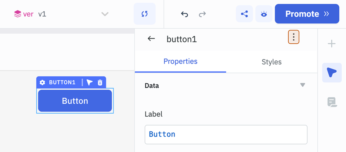
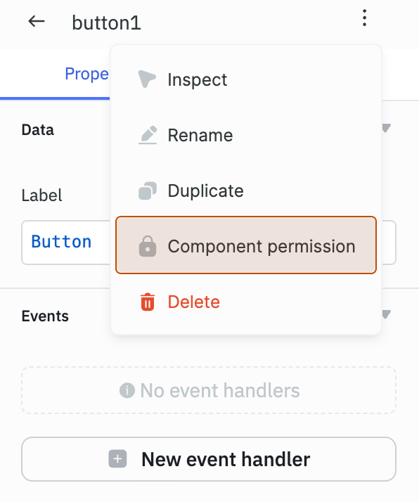
- Select the component, then click the kebab menu (three dots) next to the component name in the properties panel.
- Select Component permission.
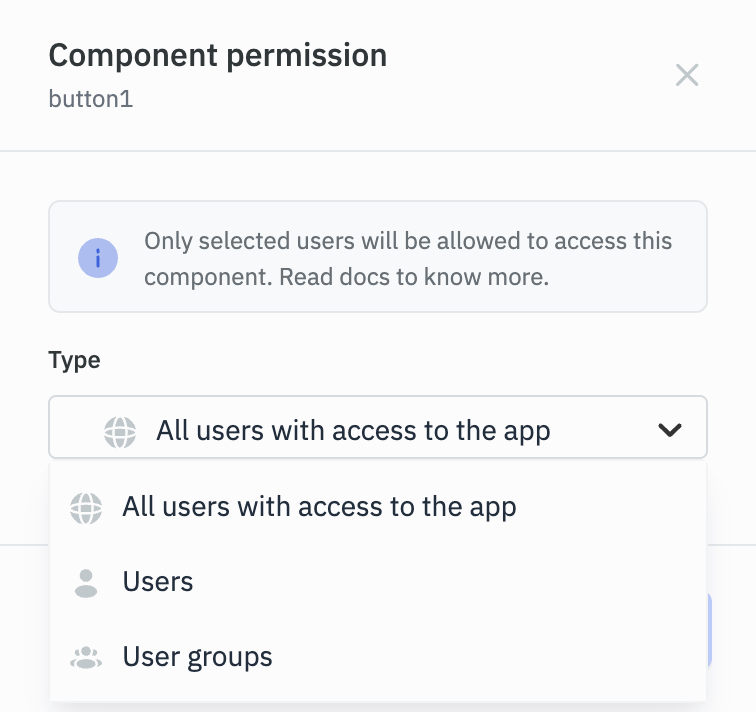
- Select the Type:
- All users with access to the app: Grants access to all users who can access the application.
- Users: Select specific users from the dropdown. Note: These users must already have access to the application.
- User groups: Restricts access to members of selected user groups. Note: The selected user groups must have access to the application.
Note: If a component's permissions have been configured by an admin and the builder is not included in the allowed users or groups, the builder will not be able to modify the component’s permissions.