App Themes
ToolJet supports App Themes giving teams complete control over the look and feel of their applications. With this feature, you can define and manage multiple themes and apply them across your apps in a consistent and reusable way.
Each workspace can have one or more themes configured, and any application within that workspace can use any of the defined themes. This helps in maintaining visual consistency across applications, improves brand alignment, and enhances user experience.
Why Use App Themes?
App Themes empower your organization by:
- Brand consistency: Align your internal tools with your company’s visual identity.
- Reusability: Define once, use across multiple apps.
- Customization: Update the look of all your apps in one go by editing the theme.
- Collaboration: Teams working on different apps can maintain a unified design system.
This is especially useful for teams with apps across different environments (e.g., internal tools, client-facing apps, admin panels) where each might need a slightly different yet consistent visual identity.
How to Use App Themes
An App Theme allows you to customize the UI components of your ToolJet apps by configuring a set of visual styles such as:
- Brand Colors (Primary, Secondary, Tertiary)
- Text colors
- Border and surface styling
- System state colors (e.g., error, success)
You can configure these settings for both light and dark modes, and instantly preview changes using the built-in preview panel.
Using App Themes in ToolJet involves two simple steps — creating the theme and applying it to your applications.
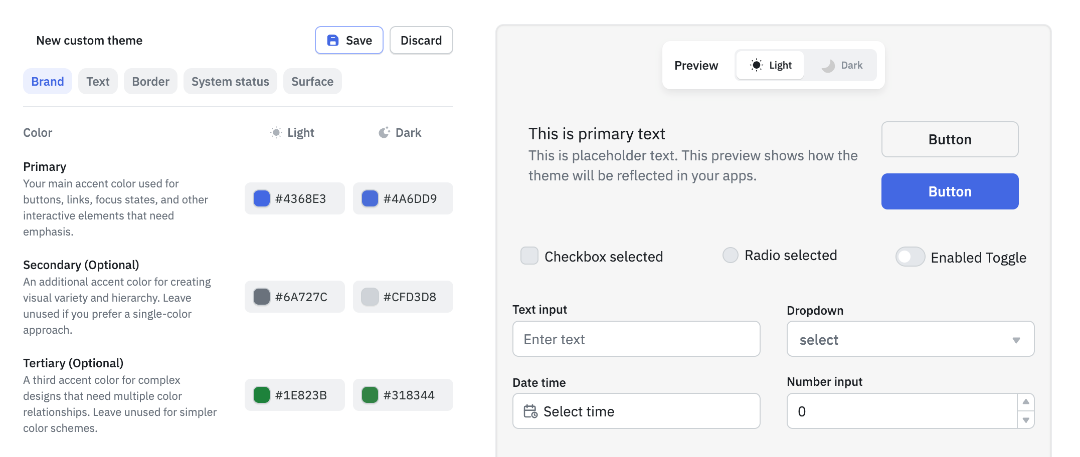
1. Create an App Theme
Role Required: Admin
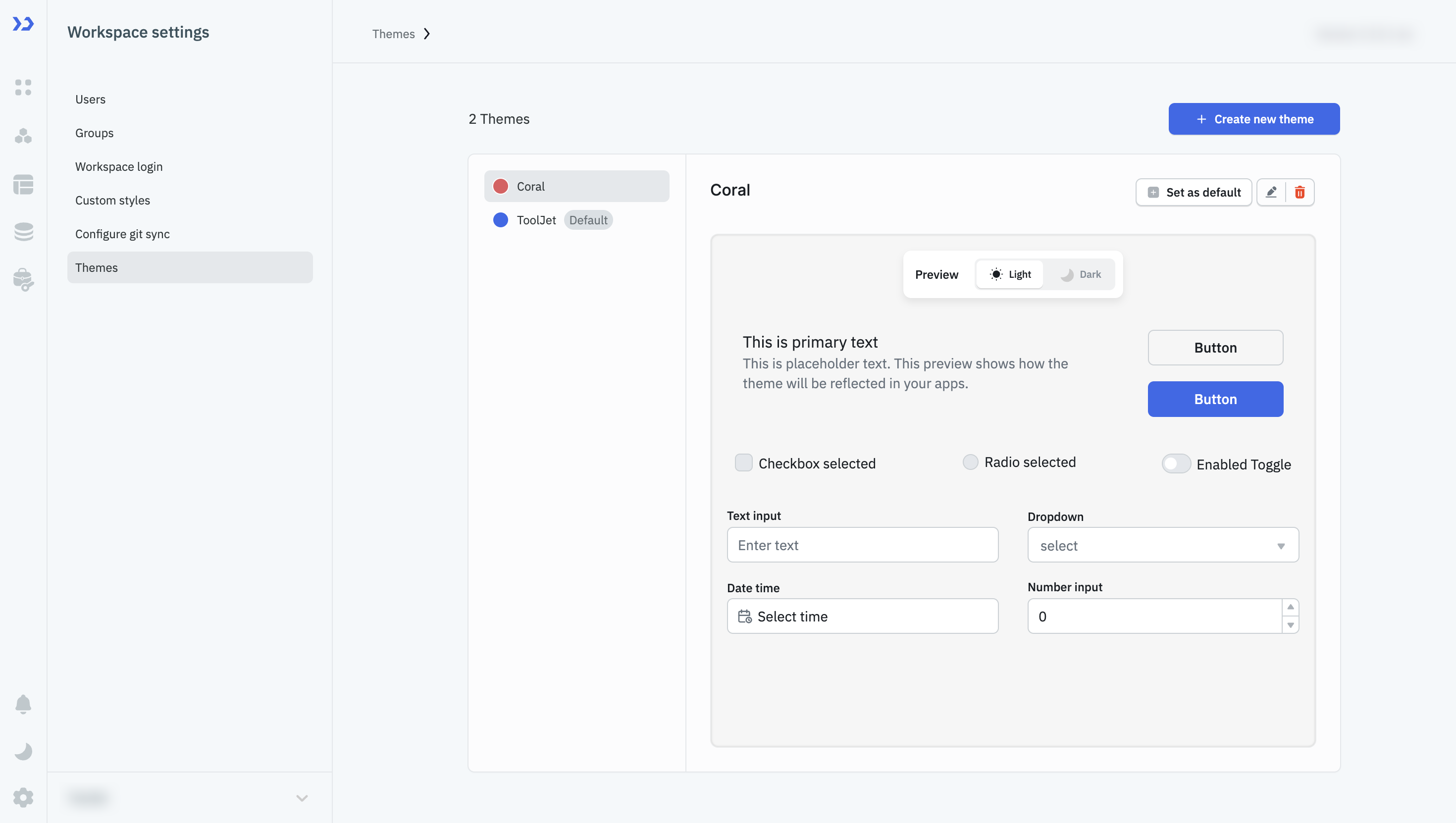
- Go to your Workspace Settings.
- Click on the Theme tab.
- Click Create new theme.
- Configure your theme styles:
- Set your Brand colors: Primary, Secondary, Tertiary
- Define Text, Border, System status, and Surface colors
- Choose styles for both Light and Dark modes
- Click Save once you're done.
You can create multiple themes as per your needs — for different teams, environments, or clients.
2. Apply the Theme to Your Application
Role Required: Admin/Builder
- Open the app where you want to use the theme.
- Click the Settings icon in the left sidebar to open Global Settings.
- Scroll down to the Theme section.
- You’ll see a dropdown showing the currently selected theme (usually the default).
- Click the dropdown to view and select from all your configured themes.
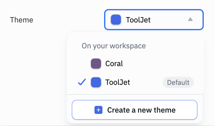
Once selected, your app will now use the chosen theme as the base style for components.
3. Use Theme Styles in Your Components
To make your components adopt the theme styles:
- Select a component in the app canvas.
- Go to the Style tab of the component.
- Wherever color can be set (background, border, text), you’ll see a Theme option next to the color picker. Once selected you'll see the list of theme colors such as Brand/Primary, Brand/Secondary, Text/Primary, etc.
These options map directly to what you configured during theme setup.
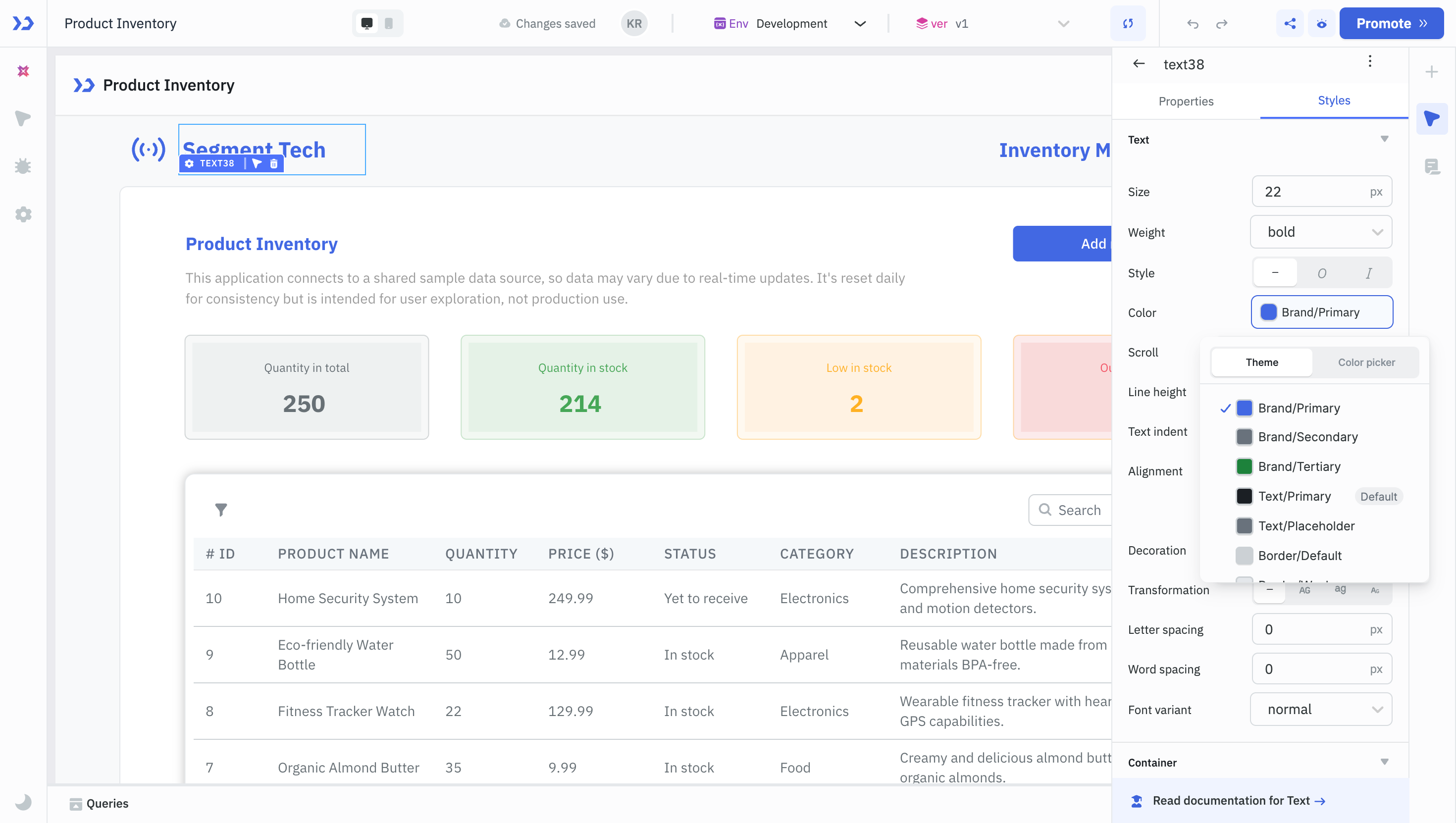
Once components are styled using theme options, changing the theme from Global Settings will instantly update all those components, making your app visually consistent and easy to update.
Scenarios
Here are some scenarios where app themes shine:
- Brand-specific apps: Create different themes for different brands/clients your company serves.
- Dark & light mode toggle: Provide a seamless visual switch for end-users between light and dark modes.
- Multi-team organizations: Let each team within your org create and maintain their own theme without affecting others.
Example
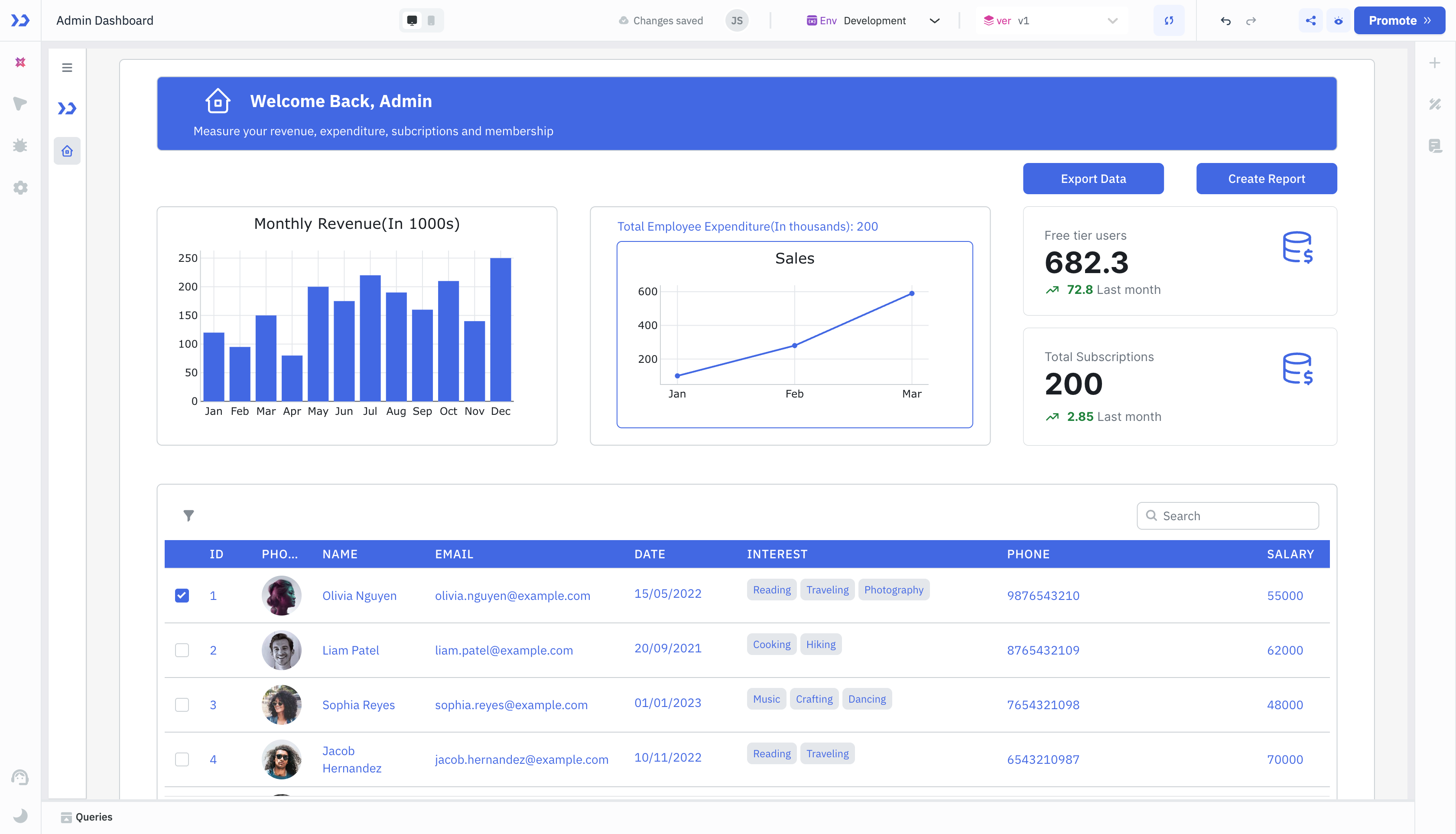
Here’s an example showing how an application interface looks before and after applying an app theme.
Before (Default Theme)
This is the default ToolJet UI without any app theme applied. It uses the standard branding and neutral colors.
After (App Theme Applied)
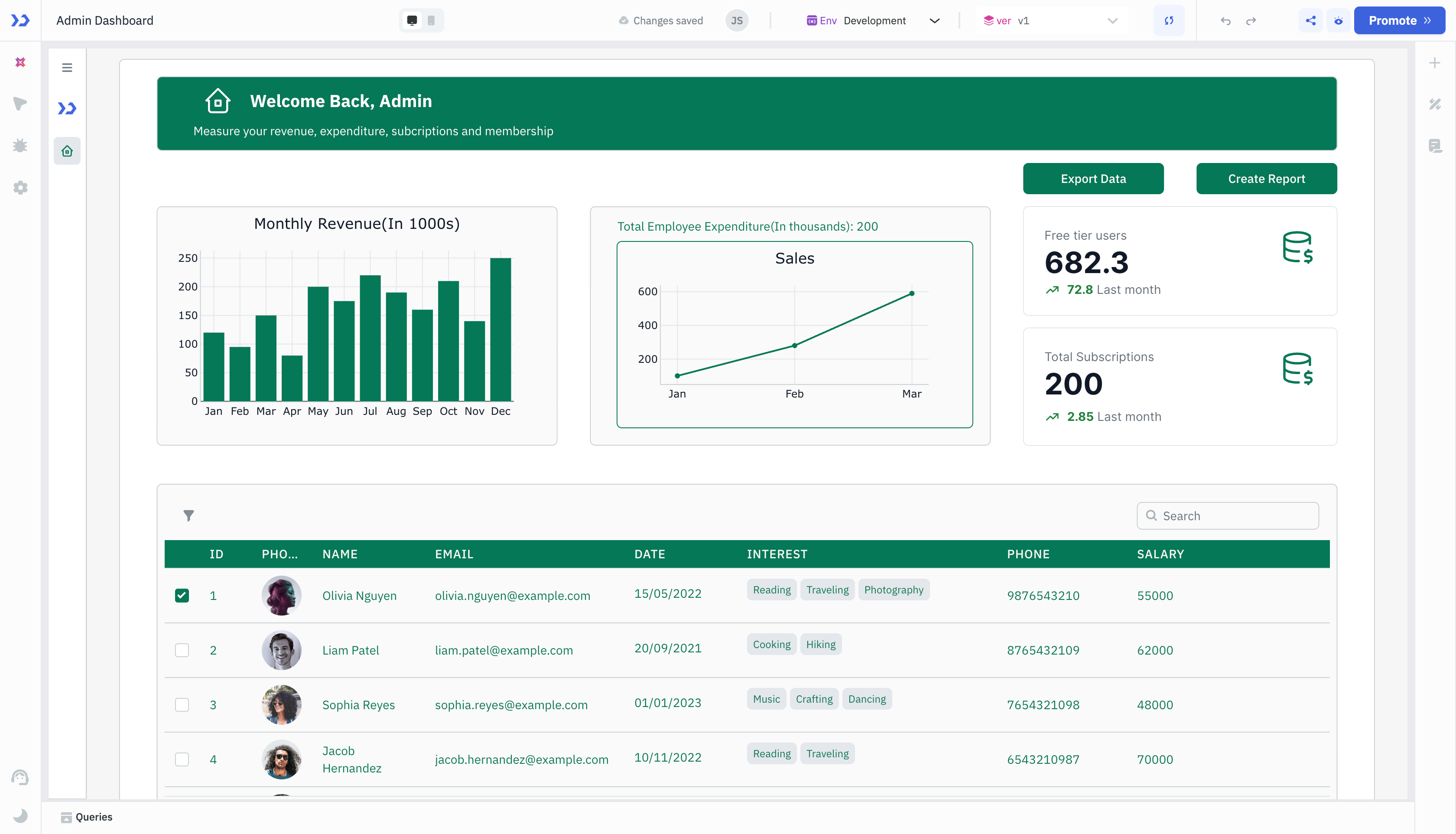
This is the same application after applying the "Coral" app theme. Notice the button color, primary accents, and overall visual alignment now reflect the chosen palette.
By simply configuring a theme once at the workspace level, you can instantly apply a fresh look across all apps, improving usability, clarity, and brand identity.