Whenever data is loaded into a Table, the columns are automatically generated. You can add, remove, or modify columns by accessing the table properties under the column section. You can also rearrange the columns by dragging and dropping them.
Use Dynamic Column
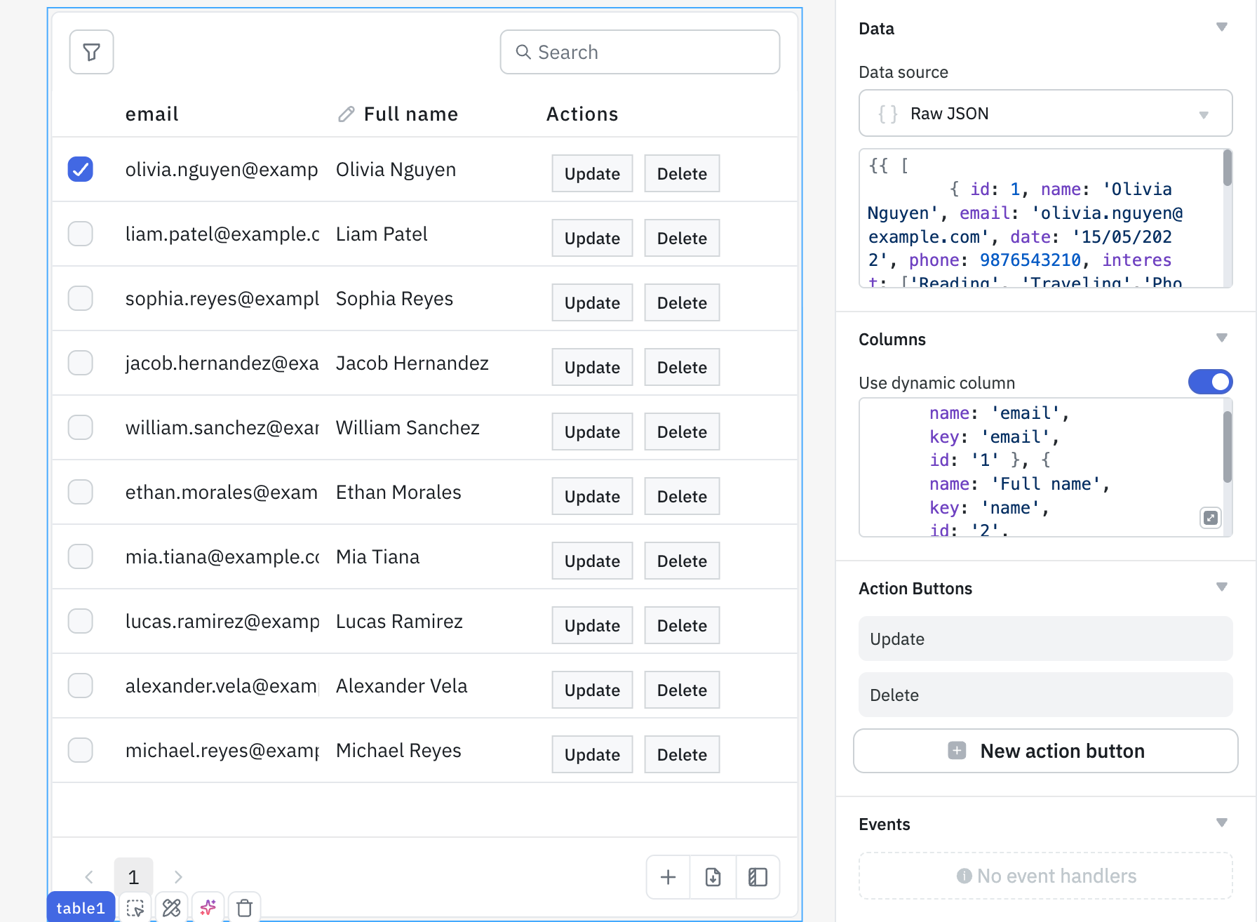
The Use dynamic column toggle allows users to dynamically set the columns of the Table using a JSON value.
For example, if you enter the below JSON, the table will display a column labeled "Name" where the data entries are editable strings, restricted in length between 5 and 20 characters, displayed in white text on a black background.
{
   "name":"Name",
   "columnType":"string",
   "key":"first_name",
   "cellBackgroundColor":"#000",
   "textColor":"#fff",
   "isEditable":true,
   "regex":"",
   "maxLength":20,
   "minLength":5,
   "customRule":""
}
Types of Columns
The table component supports the following column types:
String
This column type is used for columns with text values. Unlike the text column type, string type doesn't support multi-line text.
Properties
| Property | Description | Expected Value |
|---|
| Column Name | Specify the name to be displayed on the table column header. | String (e.g., Product Name). |
| Key | Specify the key name associated with the loaded data in the table. Uses Column name if no key is provided. | String (e.g., product_name). |
| Transformation | Allows you to transform the data of a cell value. The default value will be {{cellValue}}. | Use JavaScript for dynamic value generation, e.g., {{cellValue > 4.5 ? 5 : 4}}. |
| Make Editable | This option is disabled by default. Enabling it allows the column to be edited by app users. | Enable/disable the toggle button or dynamically configure the setting by clicking on fx and entering a logical expression. |
| Visibility | This option is enabled by default. Disabling it hides the column from the table. | Enable/disable the toggle button or dynamically configure the value by clicking on fx and entering a logical expression. |
Styles
| Property | Description | Configuration Options |
|---|
| Text Alignment | Aligns the text within the column. | Set alignment to left, center, or right, which can be specified using the switch. |
| Text Color | Modifies the color of the text in the column. | Select the color or click on fx and input code that programmatically returns a Hex color code. |
| Cell Color | Adjusts the background color of the cell. | Select the color or click on fx and input code that programmatically returns a Hex color code. |
Number
Selecting the column type as number will load numerical data in the column cells.
Properties
| Property | Description | Expected Value |
|---|
| Column Name | Specify the name to be displayed on the table column header. | String (e.g., Quantity). |
| Key | Specify the key name associated with the loaded data in the table. Uses Column name if no key is provided. | String (e.g., quantity). |
| Transformation | Allows you to transform the data of a cell value. The default value will be {{cellValue}}. | Use JavaScript for dynamic value generation, e.g., {{cellValue > 4.5 ? 5 : 4}}. |
| Decimal places | Specifies the number of decimal places for numerical values. | Integer (e.g., {{2}}). |
| Make Editable | This option is disabled by default. Enabling it allows the column to be edited by app users. | Enable/disable the toggle button or dynamically configure the setting by clicking on fx and entering a logical expression. |
| Visibility | This option is enabled by default. Disabling it hides the column from the table. | Enable/disable the toggle button or dynamically configure the value by clicking on fx and entering a logical expression. |
Styles
| Property | Description | Configuration Options |
|---|
| Text Alignment | Aligns the text within the column. | Set alignment to left, center, or right, which can be specified using the switch. |
| Text Color | Modifies the color of the text in the column. | Select the color or click on fx and input code that programmatically returns a Hex color code. |
| Cell Color | Adjusts the background color of the cell. | Select the color or click on fx and input code that programmatically returns a Hex color code. |
Text
The text column type can be used for multi-line text.
Properties
| Property | Description | Expected Value |
|---|
| Column Name | Specify the name to be displayed on the table column header. | String (e.g., Product Description). |
| Key | Specify the key name associated with the loaded data in the table. Uses Column name if no key is provided. | String (e.g., product_description). |
| Transformation | Allows you to transform the data of a cell value. The default value will be {{cellValue}}. | Use JavaScript for dynamic value generation, e.g., {{cellValue > 4.5 ? 5 : 4}}. |
| Make Editable | This option is disabled by default. Enabling it allows the column to be edited by app users. | Enable/disable the toggle button or dynamically configure the setting by clicking on fx and entering a logical expression. |
| Visibility | This option is enabled by default. Disabling it hides the column from the table. | Enable/disable the toggle button or dynamically configure the value by clicking on fx and entering a logical expression. |
Styles
| Property | Description | Configuration Options |
|---|
| Text Alignment | Aligns the text within the column. | Set alignment to left, center, or right, which can be specified using the switch. |
| Text Color | Modifies the color of the text in the column. | Select the color or click on fx and input code that programmatically returns a Hex color code. |
| Cell Color | Adjusts the background color of the cell. | Select the color or click on fx and input code that programmatically returns a Hex color code. |
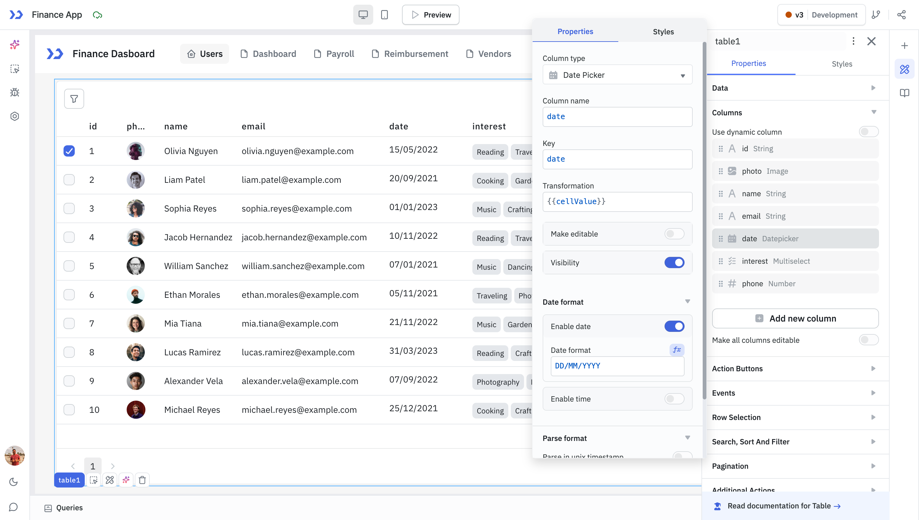
Date Picker
The Date Picker type can be used to display dates.
Properties
| Property | Description | Expected Value |
|---|
| Column Name | Specify the name to be displayed on the table column header. | Date (e.g., 13/09/1990) |
| Key | Specify the key name associated with the loaded data in the table. Uses Column name if no key is provided. | String (e.g., listing_date) |
| Transformation | Allows you to transform the data of a cell value. The default value will be {{cellValue}}. | Use JavaScript for dynamic value generation, e.g., {{cellValue > 4.5 ? 5 : 4}}. |
| Make Editable | This option is disabled by default. Enabling it allows the column to be edited by app users. | Enable/disable the toggle button or dynamically configure the value by clicking on fx and entering a logical expression. |
| Visibility | This option is enabled by default. Disabling it hides the column from the table. | Enable/disable the toggle button or dynamically configure the value by clicking on fx and entering a logical expression. |
| Property | Description | Configuration Options |
|---|
| Enable date | Enables the option to change the formatting of the date. | Use the toggle button or click on fx and enter a logical expression. |
| Date format | Configures the display format for date values within the column. | Use the drop down with common formats (Default: DD/MM/YYYY) or click on fx and enter a logical expression. |
| Enable time | Enables the option to change the formatting of the time. | Use the toggle button or click on fx and enter a logical expression. |
| Enable 24 hr time format | Enables the option to change the formatting of the time to 24 hours. | Use the toggle button or click on fx and enter a logical expression. |
| Time zone | Allows the selection of timezone. | Use the drop down to select the time zone. |
| Property | Description | Configuration Options |
|---|
| Parse in unix timestamp | Enables parsing and display of date, time, and time zone data. | Use the toggle button or click on fx and enter a logical expression. |
| Unix timestamp | Select between s or ms as the format. | Use the drop down to select the desired unix timestamp format. |
Styles
| Property | Description | Configuration Options |
|---|
| Text Alignment | Aligns the text within the column. | Set alignment to left, center, or right, which can be specified using the switch. |
| Text Color | Modifies the color of the text in the column. | Select the color or click on fx and input code that programmatically returns a Hex color code. |
| Cell Color | Adjusts the background color of the cell. | Select the color or click on fx and input code that programmatically returns a Hex color code. |
Select
The select column can be used to display or select a single item from a list.
Properties
| Property | Description | Expected Value |
|---|
| Column Name | Specify the name to be displayed on the table column header. | String (e.g., Category). |
| Key | Specify the key name associated with the loaded data in the table. Uses Column name if no key is provided. | String (e.g., category). |
| Transformation | Allows you to transform the data of a cell value. The default value will be {{cellValue}}. | Use JavaScript for dynamic value generation, e.g., {{cellValue > 4.5 ? 5 : 4}}. |
| Make Editable | This option is disabled by default. Enabling it allows the column to be edited by app users. | Enable/disable the toggle button or dynamically configure the setting by clicking on fx and entering a logical expression. |
| Visibility | This option is enabled by default. Disabling it hides the column from the table. | Enable/disable the toggle button or dynamically configure the value by clicking on fx and entering a logical expression. |
Options
Options can be used to provide values for the select column as an array. You can click on the Add new option button and enter Option label and Option value to create a new option. You can switch on the toggle for Make this option as default to mark an option as the default value. You can also enable Dynamic option and enter an array of values and label. Auto assign colors can be toggled on to color code labels to visually segregate information in table.
{{[{ label: "Mobile Phones", value: "mobile-phones" },
  { label: "Smartphones", value: "smartphones" },
  { label: "Compact Cameras", value: "compact-cameras" },
  { label: "DSLR Cameras", value: "dslr-cameras" },
  { label: "Smart Watches", value: "smart-watches" },
]}}
Styles
| Property | Description | Configuration Options |
|---|
| Text Alignment | Aligns the text within the column. | Set alignment to left, center, or right, which can be specified using the switch. |
| Text Color | Modifies the color of the text in the column. | Select the color or click on fx and input code that programmatically returns a Hex color code. |
| Cell Color | Adjusts the background color of the cell. | Select the color or click on fx and input code that programmatically returns a Hex color code. |
MultiSelect
The MultiSelect column can be used to display or select multiple items from a list.
Properties
| Property | Description | Expected Value |
|---|
| Column Name | Specify the name to be displayed on the table column header. | String (e.g., Locations). |
| Key | Specify the key name associated with the loaded data in the table. Uses Column name if no key is provided. | String (e.g., locations). |
| Transformation | Allows you to transform the data of a cell value. The default value will be {{cellValue}}. | Use JavaScript for dynamic value generation, e.g., {{cellValue > 4.5 ? 5 : 4}}. |
| Make Editable | This option is disabled by default. Enabling it allows the column to be edited by app users. | Enable/disable the toggle button or dynamically configure the setting by clicking on fx and entering a logical expression. |
| Visibility | This option is enabled by default. Disabling it hides the column from the table. | Enable/disable the toggle button or dynamically configure the value by clicking on fx and entering a logical expression. |
Options
Options can be used to provide values for the select column as an array. You can click on the Add new option button and enter Option label and Option value to set the option values. You can switch on the toggle for Make this option as default to mark an option as the default value. You can also enable Dynamic option and enter an array of values and label. Auto assign colors can be toggled on to color code labels to visually segregate information in table.
{{[{ label: "Technology", value: "technology" },
  { label: "Apparrel", value: "apparrel" },
  { label: "Jewelry", value: "jewelry" },
  { label: "Furniture", value: "furniture" },
]}}
Styles
| Property | Description | Configuration Options |
|---|
| Text Alignment | Aligns the text within the column. | Set alignment to left, center, or right, which can be specified using the switch. |
| Text Color | Modifies the color of the text in the column. | Select the color or click on fx and input code that programmatically returns a Hex color code. |
| Cell Color | Adjusts the background color of the cell. | Select the color or click on fx and input code that programmatically returns a Hex color code. |
Boolean
The boolean column type can be used to display boolean values. If the value is true, a green tick will be displayed and for false values a red cross will be displayed.
Properties
| Property | Description | Expected Value |
|---|
| Column name | Specify the name to be displayed on the table column header. | String (e.g., Validity). |
| Key | Specify the key name associated with the loaded data in the table. Uses Column name if no key is provided. | String (e.g., is_valid). |
| Transformation | Allows you to transform the data of a cell value. The default value will be {{cellValue}}. | Use JavaScript for dynamic value generation, e.g., {{cellValue > 4.5 ? 5 : 4}}. |
| Make Editable | This option is disabled by default. Enabling it allows the column to be edited by app users. | Enable/disable the toggle button or dynamically configure the setting by clicking on fx and entering a logical expression. |
| Visibility | This option is enabled by default. Disabling it hides the column from the table. | Enable/disable the toggle button or dynamically configure the value by clicking on fx and entering a logical expression. |
Styles
| Property | Description | Configuration Options |
|---|
| Alignment | Aligns the text within the column. | Set alignment to left, center, or right, which can be specified using the switch. |
| Checked | Select color for checked checkbox. | Select the color or click on fx and input code that programmatically returns a Hex color code. |
| Unchecked | Select color for unchecked checkbox. | Select the color or click on fx and input code that programmatically returns a Hex color code. |
| Cell Color | Adjusts the background color of the cell. | Select the color or click on fx and input code that programmatically returns a Hex color code. |
Image
The image column type can be used to display images.
Properties
| Property | Description | Expected Value |
|---|
| Column name | Specify the name to be displayed on the table column header. | String (e.g., Product Image). |
| Key | Specify the key name associated with the loaded data in the table. Uses Column name if no key is provided. | String (e.g., product_image). |
| Transformation | Allows you to transform the data of a cell value. The default value will be {{cellValue}}. | Use JavaScript for dynamic value generation, e.g., {{cellValue > 4.5 ? 5 : 4}}. |
| Visibility | This option is enabled by default. Disabling it hides the column from the table. | Enable/disable the toggle button or dynamically configure the value by clicking on fx and entering a logical expression. |
Styles
| Property | Description | Configuration Options |
|---|
| Text Alignment | Aligns the text within the column. | Set alignment to left, center, or right, which can be specified using the switch. |
| Text Color | Modifies the color of the text in the column. | Select the color or click on fx and input code that programmatically returns a Hex color code. |
| Cell Color | Adjusts the background color of the cell. | Select the color or click on fx and input code that programmatically returns a Hex color code. |
Link
Properties
| Property | Description | Expected Value |
|---|
| Column Name | Specify the name to be displayed on the table column header. | String (e.g., Product Description). |
| Key | Specify the key name associated with the loaded data in the table. Uses Column name if no key is provided. | String (e.g., id). |
| Transformation | Allows you to transform the data of a cell value. The default value will be {{cellValue}}. | Use JavaScript for dynamic value generation, e.g., {{cellValue > 4.5 ? 5 : 4}}. |
| Display Text | Choose the display text for the link. | String |
| Open in new tab | Toggle on to open the link in new tab whenever clicked. | Enable/disable the toggle button or dynamically configure the value by clicking on fx and entering a logical expression. |
| Visibility | This option is enabled by default. Disabling it hides the column from the table. | Enable/disable the toggle button or dynamically configure the value by clicking on fx and entering a logical expression. |
Styles
| Property | Description | Configuration Options |
|---|
| Text Alignment | Aligns the text within the column. | Set alignment to left, center, or right, which can be specified using the switch. |
| Text Color | Modifies the color of the text in the column. | Select the color or click on fx and input code that programmatically returns a Hex color code. |
| Cell Color | Adjusts the background color of the cell. | Select the color or click on fx and input code that programmatically returns a Hex color code. |
Rating
The Rating column type displays an interactive star or heart rating within table cells. This is useful for displaying customer reviews, product ratings, priority levels, or any data that can be represented on a numeric scale.
Properties
| Property | Description | Expected Value |
|---|
| Column Name | Specify the name to be displayed on the table column header. | String (e.g., Customer Rating). |
| Key | Specify the key name associated with the loaded data in the table. Uses Column name if no key is provided. | String (e.g., rating). |
| Transformation | Allows you to transform the data of a cell value. The default value will be {{cellValue}}. | Use JavaScript for dynamic value generation, e.g., {{cellValue > 4.5 ? 5 : 4}}. |
| Icon | Choose between stars or hearts as the rating icon. | Toggle between Stars and Hearts (Default: Stars). |
| Make Editable | This option is disabled by default. Enabling it allows the column to be edited by app users. | Enable/disable the toggle button or dynamically configure the setting by clicking on fx and entering a logical expression. |
| Visibility | This option is enabled by default. Disabling it hides the column from the table. | Enable/disable the toggle button or dynamically configure the value by clicking on fx and entering a logical expression. |
Options
| Property | Description | Expected Value |
|---|
| Max rating | Sets the maximum number of rating icons to display. | Integer (Default: 5). |
| Default rating | Sets the default rating value for cells with empty or null values. | Integer (e.g., 3). |
| Allow half rating | Enables half-star or half-heart ratings for more precise values. | Enable/disable the toggle button or dynamically configure the value by clicking on fx and entering a logical expression (Default: false). |
Styles
| Property | Description | Configuration Options |
|---|
| Alignment | Aligns the rating icons within the column. | Set alignment to left, center, or right, which can be specified using the switch. |
| Selected color | Sets the color for selected (filled) rating icons. | Select the color or click on fx and input code that programmatically returns a Hex color code (Default: #EFB82D for stars, #EE5B67 for hearts). |
| Unselected color | Sets the color for unselected (empty) rating icons. | Select the color or click on fx and input code that programmatically returns a Hex color code. |
JSON
Properties
| Property | Description | Expected Value |
|---|
| Column Name | Specify the name to be displayed on the table column header. | String (e.g., Product Description). |
| Key | Specify the key name associated with the loaded data in the table. Uses Column name if no key is provided. | String (e.g., id). |
| Transformation | Allows you to transform the data of a cell value. The default value will be {{cellValue}}. | Use JavaScript for dynamic value generation, e.g., {{cellValue > 4.5 ? 5 : 4}}. |
| Make Editable | This option is disabled by default. Enabling it allows the column to be edited by app users. | Enable/disable the toggle button or dynamically configure the setting by clicking on fx and entering a logical expression. |
| Indent | Choose whether to display JSON in the indented format. | Enable/disable the toggle button or dynamically configure the setting by clicking on fx and entering a logical expression. |
| Visibility | This option is enabled by default. Disabling it hides the column from the table. | Enable/disable the toggle button or dynamically configure the value by clicking on fx and entering a logical expression. |
Styles
| Property | Description | Configuration Options |
|---|
| Text Alignment | Aligns the text within the column. | Set alignment to left, center, or right, which can be specified using the switch. |
| Text Color | Modifies the color of the text in the column. | Select the color or click on fx and input code that programmatically returns a Hex color code. |
| Cell Color | Adjusts the background color of the cell. | Select the color or click on fx and input code that programmatically returns a Hex color code. |
Markdown
Properties
| Property | Description | Expected Value |
|---|
| Column Name | Specify the name to be displayed on the table column header. | String (e.g., Product Description). |
| Key | Specify the key name associated with the loaded data in the table. Uses Column name if no key is provided. | String (e.g., id). |
| Transformation | Allows you to transform the data of a cell value. The default value will be {{cellValue}}. | Use JavaScript for dynamic value generation, e.g., {{cellValue > 4.5 ? 5 : 4}}. |
| Make Editable | This option is disabled by default. Enabling it allows the column to be edited by app users. | Enable/disable the toggle button or dynamically configure the setting by clicking on fx and entering a logical expression. |
| Visibility | This option is enabled by default. Disabling it hides the column from the table. | Enable/disable the toggle button or dynamically configure the value by clicking on fx and entering a logical expression. |
Styles
| Property | Description | Configuration Options |
|---|
| Text Alignment | Aligns the text within the column. | Set alignment to left, center, or right, which can be specified using the switch. |
| Text Color | Modifies the color of the text in the column. | Select the color or click on fx and input code that programmatically returns a Hex color code. |
| Cell Color | Adjusts the background color of the cell. | Select the color or click on fx and input code that programmatically returns a Hex color code. |
HTML
Properties
| Property | Description | Expected Value |
|---|
| Column Name | Specify the name to be displayed on the table column header. | String (e.g., Product Description). |
| Key | Specify the key name associated with the loaded data in the table. Uses Column name if no key is provided. | String (e.g., id). |
| Transformation | Allows you to transform the data of a cell value. The default value will be {{cellValue}}. | Use JavaScript for dynamic value generation, e.g., {{cellValue > 4.5 ? 5 : 4}}. |
| Make Editable | This option is disabled by default. Enabling it allows the column to be edited by app users. | Enable/disable the toggle button or dynamically configure the setting by clicking on fx and entering a logical expression. |
| Visibility | This option is enabled by default. Disabling it hides the column from the table. | Enable/disable the toggle button or dynamically configure the value by clicking on fx and entering a logical expression. |
Styles
| Property | Description | Configuration Options |
|---|
| Text Alignment | Aligns the text within the column. | Set alignment to left, center, or right, which can be specified using the switch. |
| Text Color | Modifies the color of the text in the column. | Select the color or click on fx and input code that programmatically returns a Hex color code. |
| Cell Color | Adjusts the background color of the cell. | Select the color or click on fx and input code that programmatically returns a Hex color code. |
The Tags column type displays values as colored tag chips. It supports both a predefined list of options and user-created tags entered at runtime.
Properties
| Property | Description | Expected Value |
|---|
| Column Name | Specify the name to be displayed on the table column header. | String (e.g., Status). |
| Key | Specify the key name associated with the loaded data in the table. Uses Column name if no key is provided. | String (e.g., status). |
| Options | Define the list of predefined tag options. Each option requires a label (displayed text) and a value (stored value). | Array of objects, e.g., [{label: "Active", value: "active"}]. |
| Allow multi-select | When enabled, multiple tags can be selected per cell. New tags added by the user are appended to the selection. When disabled, a new tag replaces the current one. | Toggle or fx expression. |
| Auto-assign colors | Automatically assigns a unique color to each tag based on its value. | Toggle or fx expression. |
| Make Editable | Allows end users to select from predefined options or add new tags by typing in the search box and pressing Enter or clicking Add. A cross icon appears on each chip when the column is editable. | Toggle or fx expression. |
| Visibility | Controls column visibility. | Toggle or fx expression. |
When a user adds a new tag that is not in the predefined list, both the label and value for that tag are set to the text the user typed. New tags flow into changeSet, dataUpdates, and related exposed variables the same way edits to Select or MultiSelect columns do.
Styles
| Property | Description | Configuration Options |
|---|
| Text Alignment | Aligns the tag chips within the column. | Set alignment to left, center, or right. |
| Cell Color | Adjusts the background color of the cell. | Select a color or use fx to return a Hex color code. |
The Button column type renders one or more action buttons inside each table cell. It replaces the legacy Action Buttons section with a fully configurable per-column button setup that supports icons, tooltips, loading states, visibility, and programmable styles.
You can add multiple Button columns to the same table and position each column anywhere by dragging it in the column list.
Click the + Add button option inside a Button column to add buttons. Use the drag handles in the button list to reorder them within the column.
| Property | Description | Expected Value |
|---|
| Button label | Sets the text displayed on the button. Supports fx for dynamic values. | String or fx expression (e.g., {{rowData.status === 'active' ? 'Deactivate' : 'Activate'}}). |
| Tooltip | Shows a tooltip when the user hovers over the button. Supports fx. | String or fx expression. |
| Loading state | Shows a loading spinner on the button. Supports fx for programmatic control (e.g., bind to a query's isLoading property). | Toggle or fx expression. |
| Visibility | Controls whether the button is visible. Use fx to conditionally show or hide based on row data. | Toggle or fx expression (e.g., {{rowData.role === 'admin'}}). |
| Disable action button | Disables the button when the expression is true. | Toggle or fx expression (e.g., {{rowData.status === 'locked'}}). |
| On click | Event handler fired when the button is clicked. Clicking also updates the Table's selectedRow exposed variable. | Event handler. |
| Style Property | Description | Configuration Options |
|---|
| Button type | Sets the button variant. | Solid or Outline. |
| Background | Sets the background color (Solid mode only). Supports fx. | Color picker or fx expression. |
| Label color | Sets the button text color. Supports fx. | Color picker or fx expression. |
| Border color | Sets the border color. Supports fx. | Color picker or fx expression. |
| Loader color | Sets the color of the loading spinner. Supports fx. | Color picker or fx expression. |
| Icon | Attaches an icon to the button. Use the icon picker to choose, and toggle visibility on or off. | Icon picker. |
| Icon color | Sets the icon color. Supports fx. | Color picker or fx expression. |
| Icon alignment | Positions the icon to the left or right of the label. | Left / Right toggle. |
| Border radius | Sets the button border radius in pixels. Supports fx. | Number or fx expression. |
Default (Deprecated)
This default column is used to display text.
Properties
| Property | Description | Expected Value |
|---|
| Column Name | Specify the name to be displayed on the table column header. | String (e.g., Product Description). |
| Key | Specify the key name associated with the loaded data in the table. Uses Column name if no key is provided. | String (e.g., product_description). |
| Transformation | Allows you to transform the data of a cell value. The default value will be {{cellValue}}. | Use JavaScript for dynamic value generation, e.g., {{cellValue > 4.5 ? 5 : 4}}. |
| Make Editable | This option is disabled by default. Enabling it allows the column to be edited by app users. | Enable/disable the toggle button or dynamically configure the setting by clicking on fx and entering a logical expression. |
| Visibility | This option is enabled by default. Disabling it hides the column from the table. | Enable/disable the toggle button or dynamically configure the value by clicking on fx and entering a logical expression. |
Styles
| Property | Description | Configuration Options |
|---|
| Text Alignment | Aligns the text within the column. | Set alignment to left, center, or right, which can be specified using the switch. |
| Text Color | Modifies the color of the text in the column. | Select the color or click on fx and input code that programmatically returns a Hex color code. |
| Cell Color | Adjusts the background color of the cell. | Select the color or click on fx and input code that programmatically returns a Hex color code. |
Dropdown (Deprecated)
The Dropdown column type is used to display a dropdown in the column cells using the column data.
Properties
| Property | Description | Expected Value |
|---|
| Column Name | Specify the name to be displayed on the table column header. | String (e.g., Category). |
| Key | Specify the key name associated with the loaded data in the table. Uses Column name if no key is provided. | String (e.g., category_id). |
| Values | Provide the values for the dropdown as an array. | Array (e.g., [1, 2, 3]). |
| Labels | Provide the labels for the values in the dropdown as an array. | Array (e.g., ["Option 1", "Option 2", "Option 3"]). |
| Make Editable | This option is disabled by default. Enabling it allows the column to be edited by app users. | Enable/disable the toggle button or dynamically configure the setting by clicking on fx and entering a logical expression. |
| Visibility | This option is enabled by default. Disabling it hides the column from the table. | Enable/disable the toggle button or dynamically configure the value by clicking on fx and entering a logical expression. |
Styles
| Property | Description | Configuration Options |
|---|
| Text Alignment | Aligns the text within the column. | Set alignment to left, center, or right. |
| Text Color | Modifies the color of the text in the column. | Select the color or click on fx and input code that programmatically returns a Hex color code. |
| Cell Color | Adjusts the background color of the cell. | Select the color or click on fx and input code that programmatically returns a Hex color code. |
Multiselect (Deprecated)
The multiselect column type is used to show multiple selections or display a dropdown in the column cells using the column data.
Properties
| Property | Description | Expected Value |
|---|
| Column Name | Specify the name to be displayed on the table column header. | String (e.g., Tags). |
| Key | Specify the key name associated with the loaded data in the table. Uses Column name if no key is provided. | String (e.g., tag_ids). |
| Values | Provide the values for the dropdown as an array. | Array (e.g., [1, 2, 3]). |
| Labels | Provide the labels for the values in the dropdown as an array. | Array (e.g., ["Tag 1", "Tag 2", "Tag 3"]). |
| Make Editable | This option is disabled by default. Enabling it allows the column to be edited by app users. | Enable/disable the toggle button or dynamically configure the setting by clicking on fx and entering a logical expression. |
| Visibility | This option is enabled by default. Disabling it hides the column from the table. | Enable/disable the toggle button or dynamically configure the value by clicking on fx and entering a logical expression. |
Styles
| Property | Description | Configuration Options |
|---|
| Text Alignment | Aligns the text within the column. | Set alignment to left, center, or right. |
| Text Color | Modifies the color of the text in the column. | Select the color or click on fx and input code that programmatically returns a Hex color code. |
| Cell Color | Adjusts the background color of the cell. | Select the color or click on fx and input code that programmatically returns a Hex color code. |
Toggle Switch (Deprecated)
The Toggle Switch column type is used to display a toggle switch in the column cells, providing a clear visual indicator for boolean values.
Properties
| Property | Description | Expected Value |
|---|
| Column Name | Specify the name to be displayed on the table column header. | String (e.g., Active Status). |
| Key | Specify the key name associated with the loaded data in the table. Uses Column name if no key is provided. | String (e.g., active). |
| Active Color | Set the color of the toggle switch when it is active. | Color code (e.g., #76D7C4). |
| Make Editable | This option is disabled by default. Enabling it allows the column to be edited by app users. | Enable/disable the toggle button or dynamically configure the setting by clicking on fx and entering a logical expression. |
| Visibility | This option is enabled by default. Disabling it hides the column from the table. | Enable/disable the toggle button or dynamically configure the value by clicking on fx and entering a logical expression. |
Styles
| Property | Description | Configuration Options |
|---|
| Text Alignment | Aligns the text within the column. | Set alignment to left, center, or right. |
| Text Color | Modifies the color of the text in the column. | Select the color or click on fx and input code that programmatically returns a Hex color code. |
| Cell Color | Adjusts the background color of the cell. | Select the color or click on fx and input code that programmatically returns a Hex color code. |
Radio (Deprecated)
The Radio column type is used to show radio buttons in the column cells, offering a single-choice selection from multiple options.
Properties
| Property | Description | Expected Value |
|---|
| Column Name | Specify the name to be displayed on the table column header. | String (e.g., Membership Type). |
| Key | Specify the key name associated with the loaded data in the table. Uses Column name if no key is provided. | String (e.g., membership_type). |
| Values | Provide the values for the radio buttons as an array. | Array (e.g., [1, 2, 3]). |
| Labels | Provide the labels for the values in the radio buttons as an array. | Array (e.g., ["Gold", "Silver", "Bronze"]). |
| Make Editable | This option is disabled by default. Enabling it allows the column to be edited by app users. | Enable/disable the toggle button or dynamically configure the setting by clicking on fx and entering a logical expression. |
| Visibility | This option is enabled by default. Disabling it hides the column from the table. | Enable/disable the toggle button or dynamically configure the value by clicking on fx and entering a logical expression. |
Styles
| Property | Description | Configuration Options |
|---|
| Text Alignment | Aligns the text within the column. | Set alignment to left, center, or right. |
| Text Color | Modifies the color of the text in the column. | Select the color or click on fx and input code that programmatically returns a Hex color code. |
| Cell Color | Adjusts the background color of the cell. | Select the color or click on fx and input code that programmatically returns a Hex color code. |
Badge (Deprecated)
The Badge column type is utilized to exhibit labels or tags on the columns, visually distinguishing the data.
Properties
| Property | Description | Expected Value |
|---|
| Column Name | Specify the name to be displayed on the table column header. | String (e.g., Status). |
| Key | Specify the key name associated with the loaded data in the table. Uses Column name if no key is provided. | String (e.g., status). |
| Values | Provide the values for the badge as an array. | Array (e.g., ["new", "in_progress", "completed"]). |
| Labels | Provide the labels for the values in the badge as an array. | Array (e.g., ["New", "In Progress", "Completed"]). |
| Make Editable | This option is disabled by default. Enabling it allows the column to be edited by app users. | Enable/disable the toggle button or dynamically configure the setting by clicking on fx and entering a logical expression. |
| Visibility | This option is enabled by default. Disabling it hides the column from the table. | Enable/disable the toggle button or dynamically configure the value by clicking on fx and entering a logical expression. |
Styles
| Property | Description | Configuration Options |
|---|
| Text Alignment | Aligns the text within the column. | Set alignment to left, center, or right. |
| Text Color | Modifies the color of the text in the column. | Select the color or click on fx and input code that programmatically returns a Hex color code. |
| Cell Color | Adjusts the background color of the cell. | Select the color or click on fx and input code that programmatically returns a Hex color code. |
Multiple Badges (Deprecated)
Similar to the Badge type, the Multiple Badges type is used to display multiple badges within a column cell, providing a more nuanced display of statuses or categories.
Properties
| Property | Description | Expected Value |
|---|
| Column Name | Specify the name to be displayed on the table column header. | String (e.g., Features). |
| Key | Specify the key name associated with the loaded data in the table. Uses Column name if no key is provided. | String (e.g., features). |
| Values | Provide the values for the multiple badges as an array. | Array (e.g., ["wifi", "bluetooth", "gps"]). |
| Labels | Provide the labels for the values in the multiple badges as an array. | Array (e.g., ["WiFi", "Bluetooth", "GPS"]). |
| Make Editable | This option is disabled by default. Enabling it allows the column to be edited by app users. | Enable/disable the toggle button or dynamically configure the setting by clicking on fx and entering a logical expression. |
| Visibility | This option is enabled by default. Disabling it hides the column from the table. | Enable/disable the toggle button or dynamically configure the value by clicking on fx and entering a logical expression. |
Styles
| Property | Description | Configuration Options |
|---|
| Text Alignment | Aligns the text within the column. | Set alignment to left, center, or right. |
| Text Color | Modifies the color of the text in the column. | Select the color or click on fx and input code that programmatically returns a Hex color code. |
| Cell Color | Adjusts the background color of the cell. | Select the color or click on fx and input code that programmatically returns a Hex color code. |
The Tags column type is utilized to display an array of tags within the column cells, providing a flexible way to categorize or tag items dynamically.
Properties
| Property | Description | Expected Value |
|---|
| Column Name | Specify the name to be displayed on the table column header. | String (e.g., Tags). |
| Key | Specify the key name associated with the loaded data in the table. Uses Column name if no key is provided. | String (e.g., tag_list). |
| Make Editable | This option is disabled by default. Enabling it allows the column to be edited by app users. | Enable/disable the toggle button or dynamically configure the setting by clicking on fx and entering a logical expression. |
| Visibility | This option is enabled by default. Disabling it hides the column from the table. | Enable/disable the toggle button or dynamically configure the value by clicking on fx and entering a logical expression. |
Styles
| Property | Description | Configuration Options |
|---|
| Text Alignment | Aligns the text within the column. | Set alignment to left, center, or right. |
| Text Color | Modifies the color of the text in the column. | Select the color or click on fx and input code that programmatically returns a Hex color code. |
| Cell Color | Adjusts the background color of the cell. | Select the color or click on fx and input code that programmatically returns a Hex color code. |
Freeze Column
Every column has a Freeze column setting that pins it to the left or right edge of the table so it stays visible while the user scrolls horizontally. This is useful for keeping key identifier columns (such as Name or ID) always in view when the table has many columns.
| Option | Behavior |
|---|
| Left | Column sticks to the left edge while the rest of the table scrolls. |
| Unpinned | Default — column scrolls normally. |
| Right | Column sticks to the right edge while the rest of the table scrolls. |
You can freeze any number of columns on either side. Frozen columns display a subtle shadow at the boundary to visually separate them from scrollable columns.
Add Column
You can add a new column to the table by clicking on the + Add new column button. On clicking this button a new column will be added to the Table and you can edit its properties from the column section.
Duplicate Column
On hovering on a column, you can see a clone icon next to delete which can be used to create a duplicate copy of the same column.
Delete Column
On hovering on a column, you can see a delete icon on the right which can be used to delete a column.
Hide columns
You can choose which columns to show or hide in the Table using this option. You also have the option to hide the column selector button in the Table properties.
Make all columns editable
To make all the columns editable in your table, you can enable the Make all columns editable toggle. If you disable the Make editable property of any individual column, Make all columns editable will automatically switch to disabled.
Validation
Under column properties, when you switch on the Make editable toggle, you will be able to see validation options that will be different for each column type. For instance, the a column with string type will have the following validations.
Regex
Use this field to enter a Regular Expression that will validate the content.
Min length
Enter the number for a minimum length of characters allowed.
Max length
Enter the number for the maximum length of characters allowed.
Custom rule
If the condition is true, the validation passes, otherwise return a string that should be displayed as the error message. For example: {{components.table1.selectedRow.id==1&&"This row can't be deleted"}}