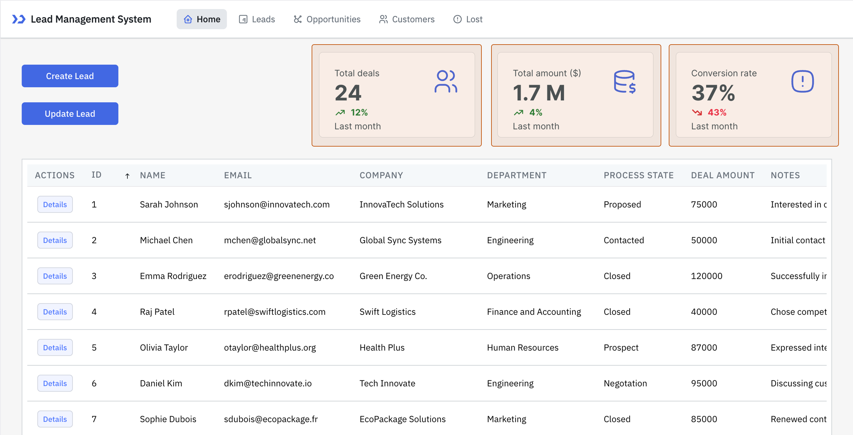
Statistics
Statistics component is used to display key metrics in a visually prominent format. It is ideal for highlighting important numbers such as revenue, user count, or task completion rates.
Why use it?
- Offers at-a-glance insights without analyzing raw data.
- Commonly used in dashboards, executive summaries, and analytics applications.
- Helps stakeholders make quick, informed decisions.
Data
Primary Values
| Property | Description |
|---|---|
| Label | The descriptive text that explains what the metric represents. |
| Value | The primary number or data point being displayed. |
| Prefix text | Text or a symbol shown before the value (e.g., $ for currency). |
| Suffix text | Text or a symbol shown after the value (e.g., % for percentage). |
Secondary Values
| Property | Description |
|---|---|
| Hide Secondary Value | Toggle to show or hide the secondary metric value. |
| Label | The descriptive text indicating what the secondary value represents. |
| Value | The metric or data point displayed in secondary value. |
| Prefix Text | Text or symbol displayed before the value (e.g., $ for currency). |
| Suffix Text | Text or symbol displayed after the value (e.g., % for percentage). |
| Trend | Indicator showing performance trend, such as positive or negative. |
Layout
| Property | Description |
|---|---|
| Data | Choose the alignment of the data (left, center, or right). |
| Secondary Value | Decide how the secondary value is aligned (vertical or horizontal). |
| Icon | Select an icon to display, or hide it and adjust its alignment (left or right). |
Component Specific Actions (CSA)
The following actions of the component can be controlled using the component-specific actions (CSA), you can trigger it using an event or use a RunJS query.
| Action | Description | RunJS Query |
|---|---|---|
| setPrimaryValue | Updates the primary metric value displayed in the component. | {{components.statistics1.setPrimaryValue}} |
| setSecondaryValue | Updates the secondary metric value displayed. | {{components.statistics1.setSecondaryValue}} |
| setLoading | Toggles the loading state of the component. | {{components.statistics1.setLoading}} |
| setVisibility | Shows or hides the component on the page. | {{components.statistics1.setVisibility}} |
Exposed Variables
| Variable | Description | How To Access |
|---|---|---|
| primaryLabel | The label text of the primary value. | {{components.statistics1.primaryLabel}} |
| secondaryLabel | The label text of the secondary value. | {{components.statistics1.secondaryLabel}} |
| primaryValue | The main metric value displayed. | {{components.statistics1.primaryValue}} |
| secondaryValue | The secondary metric value displayed. | {{components.statistics1.secondaryValue}} |
| secondarySignDisplay | Displays the trend or sign indicator for secondary value. | {{ components.statistics1.secondarySignDisplay }} |
| isLoading | Indicates whether the component is in a loading state. | {{components.statistics1.isLoading}} |
| isVisible | Indicates whether the component is visible on the page. | {{components.statistics1.isVisible}} |
Additional Actions
Action | Description | Configuration Options |
|---|---|---|
| Loading state | Enables a loading spinner, often used with isLoading to indicate progress. | Enable/disable the toggle button or dynamically configure the value by clicking fx and entering a logical expression. |
| Visibility | Controls component visibility. | Enable/disable the toggle button or dynamically configure the value by clicking fx and entering a logical expression. |
| Tooltip | Provides additional information on hover. Set a display string. | String (e.g., Total Deals ). |
Devices
Property | Description | Expected Value |
|---|---|---|
| Show on desktop | Makes the component visible in desktop view. | You can set it with the toggle button or dynamically configure the value by clicking fx and entering a logical expression. |
| Show on mobile | Makes the component visible in mobile view. | You can set it with the toggle button or dynamically configure the value by clicking fx and entering a logical expression. |
Styles
Primary Label and Value
| Label Property | Description | Configuration Options |
|---|---|---|
| Primary Label Size | Sets the font size of the primary label. | Numeric input (px) |
| Primary Label Color | Sets the color of the primary label text. | Color picker / HEX / RGBA / Custom Themes |
| Primary Value Size | Sets the font size of the primary value. | Numeric input (px) |
| Primary Value Color | Sets the color of the primary value text. | Color picker / HEX / RGBA / Custom Themes |
| Icon | Sets the icon color (if enabled). | Color picker / HEX / RGBA / Custom Themes |
Secondary Label and Value
| Label Property | Description | Configuration Options |
|---|---|---|
| Label Size | Sets the font size of the secondary label. | Numeric input (px) |
| Label Color | Sets the color of the secondary label text. | Color picker / HEX / RGBA / Custom Themes |
| Value Size | Sets the font size of the secondary value. | Numeric input (px) |
| Positive Secondary Value | Sets the color for positive secondary values. | Color picker / HEX / RGBA / Custom Themes |
| Negative Secondary Value | Sets the color for negative secondary values. | Color picker / HEX / RGBA / Custom Themes |
Container
| Label Property | Description | Configuration Options |
|---|---|---|
| Background | Sets the background color of the container. | Color picker / HEX / RGBA / Custom Themes |
| Border | Defines the border color. | Color picker / HEX / RGBA / Custom Themes |
| Border Radius | Rounds the corners of the container. | Numeric input (px) |
| Box Shadow | Applies shadow effect to the container. | Select the box shadow color and adjust the related properties or set it programmatically using fx. |
| Padding | Sets the spacing inside the container. | Default / None |
info
Any property having fx button next to its field can be programmatically configured.