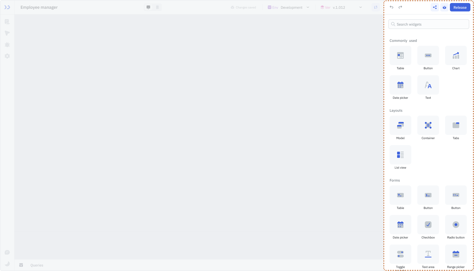
Component Library
Components are the building blocks of ToolJet applications, used to create interactive user interfaces. The Component Library, located on the right, contains all available components.
Components can be added to the canvas by dragging and dropping them onto the canvas at your desired location.
Available Components
| Category | Components |
|---|---|
| Buttons | Button, Button Group |
| Data | Table, Chart |
| Layouts | Form, Modal, Container, Tabs, ListView, Kanban, Calendar |
| Text Inputs | Text Input, Text Area, Email Input, Password Input, Rich Text Editor |
| Number Inputs | Number Input, Phone Input, Currency Input, Range Slider, Star Rating |
| Select Inputs | Dropdown, Multi-Select, Toggle Switch, Radio Button, Checkbox, Tree Select |
| Date and Time Inputs | Date-range Picker, Date Picker, Time Picker, Date-Time Picker |
| Navigation | Link, Pagination, Steps |
| Media | Icon, Image, SVG Image, PDF, Map |
| Presentation | Text, Tags, Circular Progressbar, Timeline, Divider, Vertical Divider, Spinner, Statistics, Timer |
| Custom | Custom Component, HTML Viewer, iFrame |
| Miscellaneous | Filepicker, Code Editor, Color Picker, Bounded Box, QR Scanner |
| Legacy | Modal, Datetime Picker, Radio Button, Toggle Switch, Dropdown, Multiselect |