Component Properties
Component properties define the appearance, behavior, and interactivity of UI components in ToolJet.
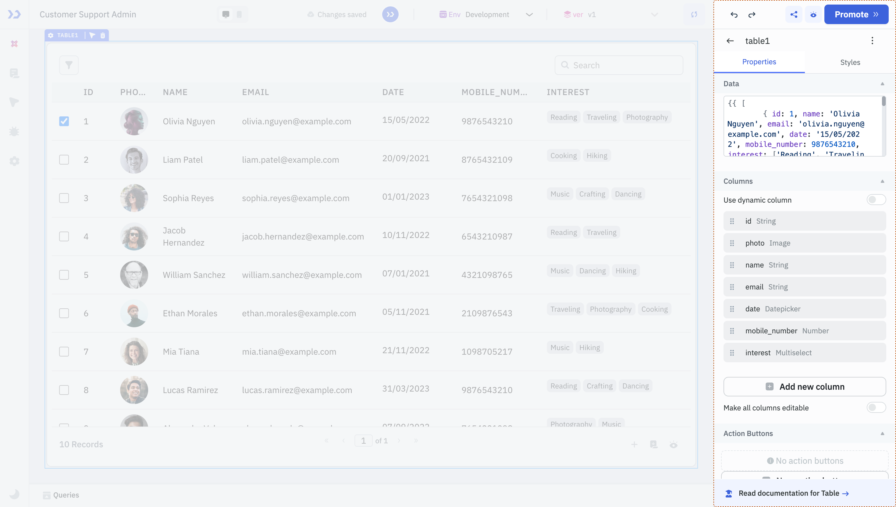
Each component includes a unique set of properties based on its functionality. Here’s an overview of common types of configurable properties:
- Labels and Data Fields: For input components, you can configure the label, add placeholders, default values, define validation rules, etc.
- Data: Populate components with static values or dynamic data through queries.
- Events: Events are actions or triggers that respond to user interactions or specific conditions in your application. They let you define custom logic (like running a query, navigating to a page, or showing a toast) in response to user activity or application changes — without writing backend code.
- Styles: Define visual attributes like colors, spacing, alignment, and border radius to adjust how the component appears.
- State: Control component states such as loading, visibility, or whether the component is disabled. You can toggle these manually or control them using logical expressions.
- Device: Configure whether the component should be visible on specific devices, such as mobile or desktop.
These are just a few commonly used property types. For detailed information on any specific component and its properties, refer to their individual documentation.